
The Heavy Medicine band needed packaging design for their new LP. I attempted to create a visual representation of the sounds and themes present on the record.
Imagery
The band had a name for the album, and an image they wanted to use for the cover. The name referred to the album being a representation of the time that the songs were recorded, a “so called era”. I wanted to follow the theme of representation, and from there created the rest of the packaging.
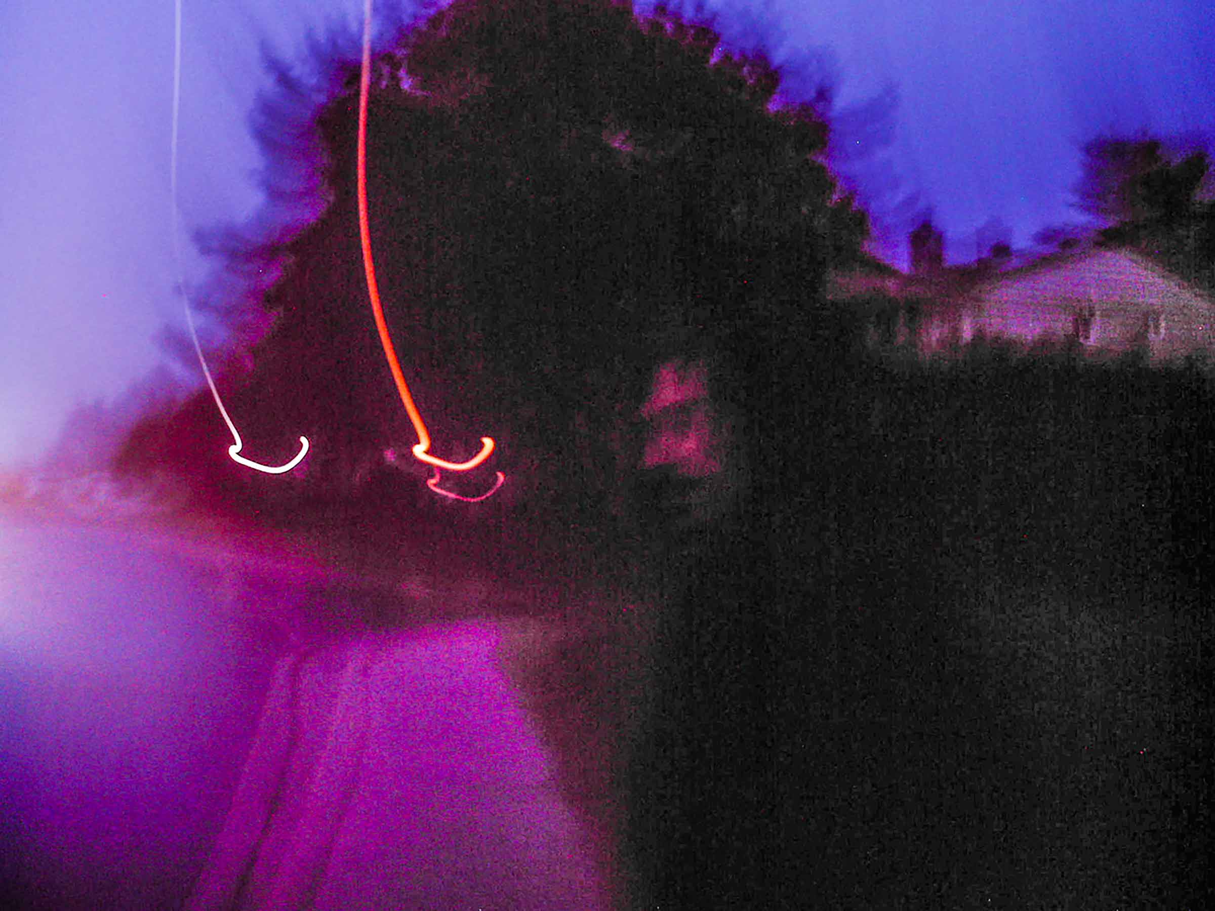
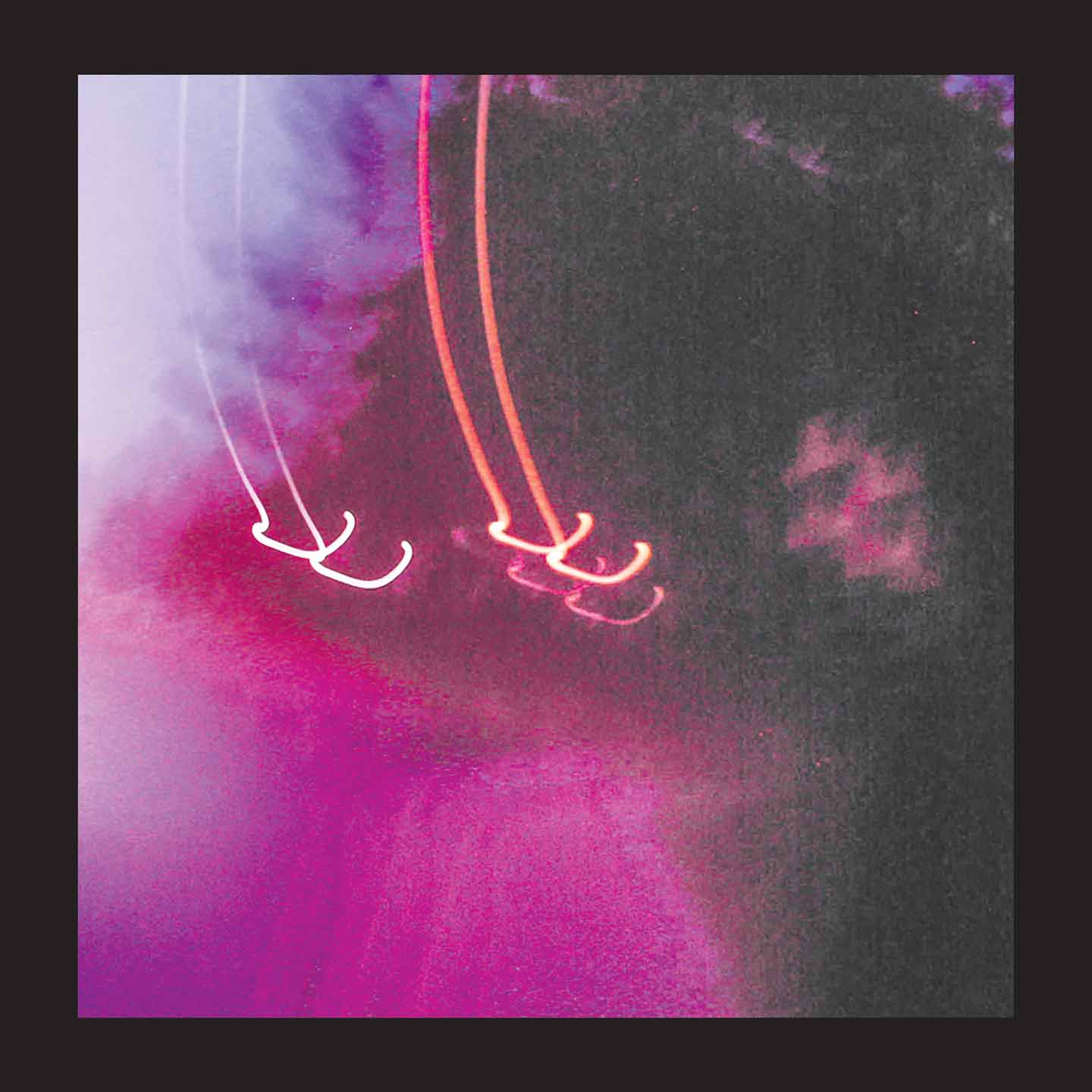
original polaroid by jessica paget
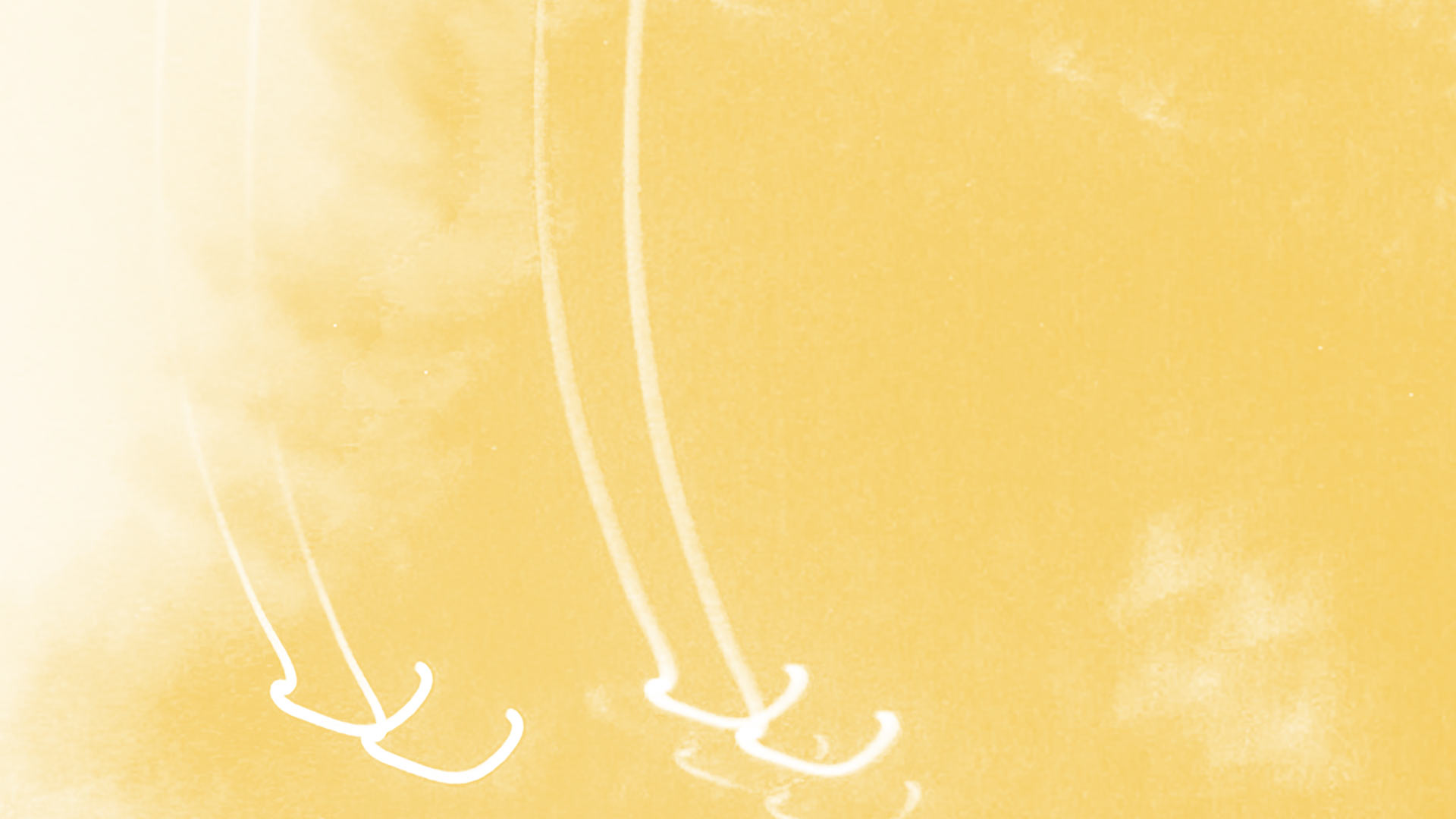
polaroid after minor treatment
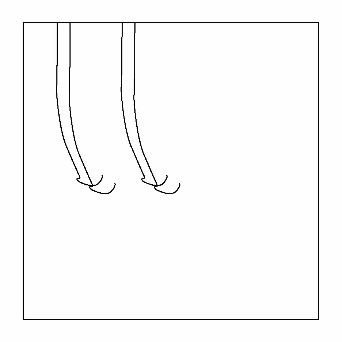
The back cover design was informed by predominant shapes in the cover image.
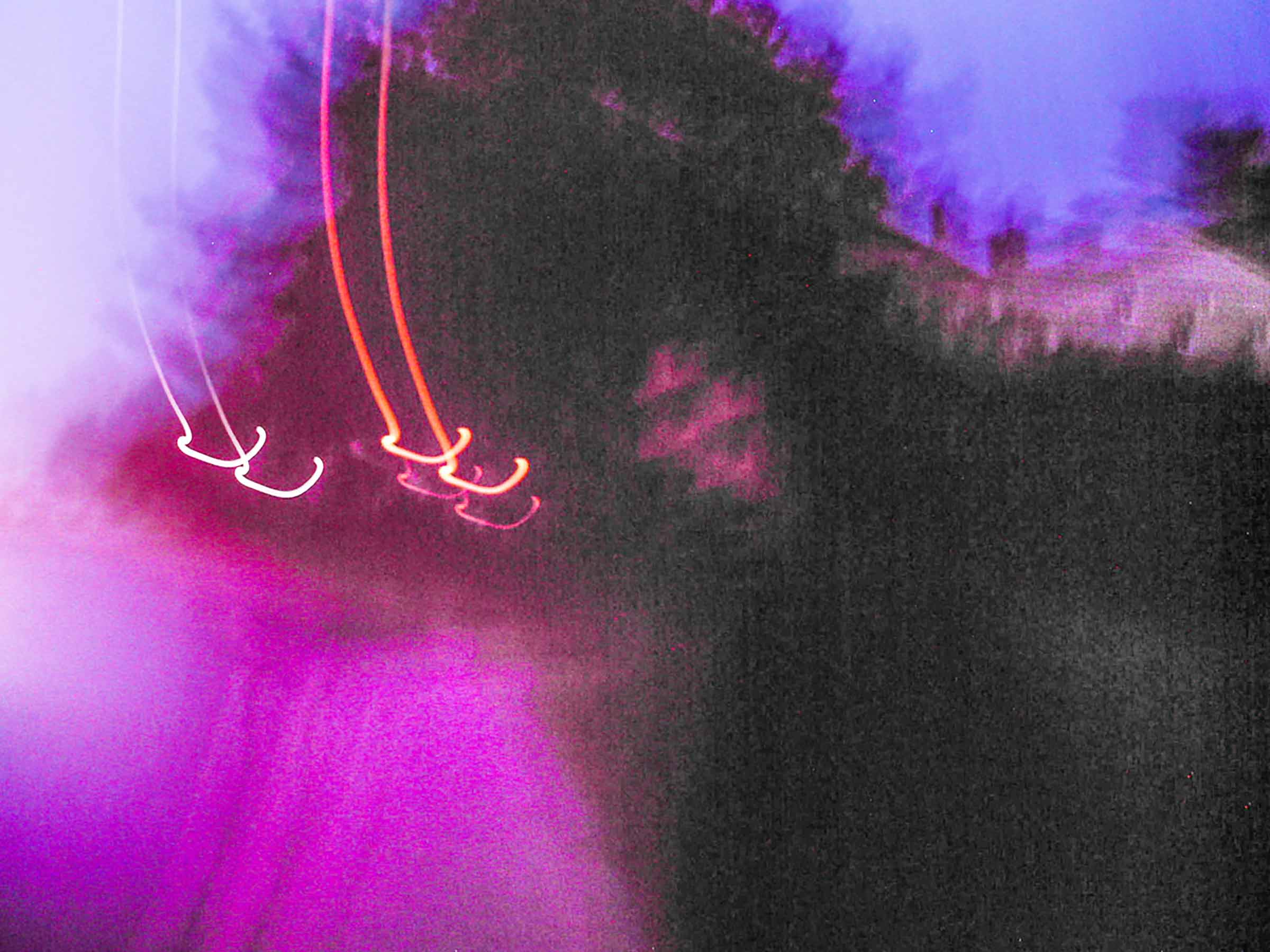
I sought an intended degredation, a sort of digital erosion, an allusion to the feedback and subtle electronic noises on the album.
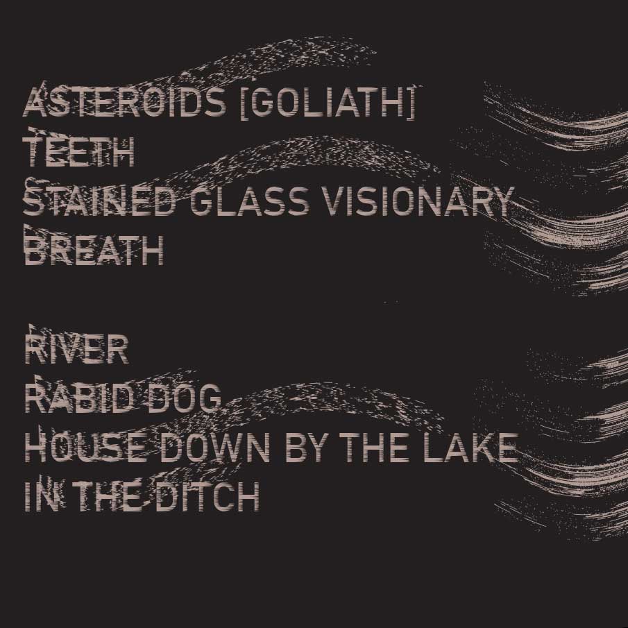
distorted ersatz era tracklist
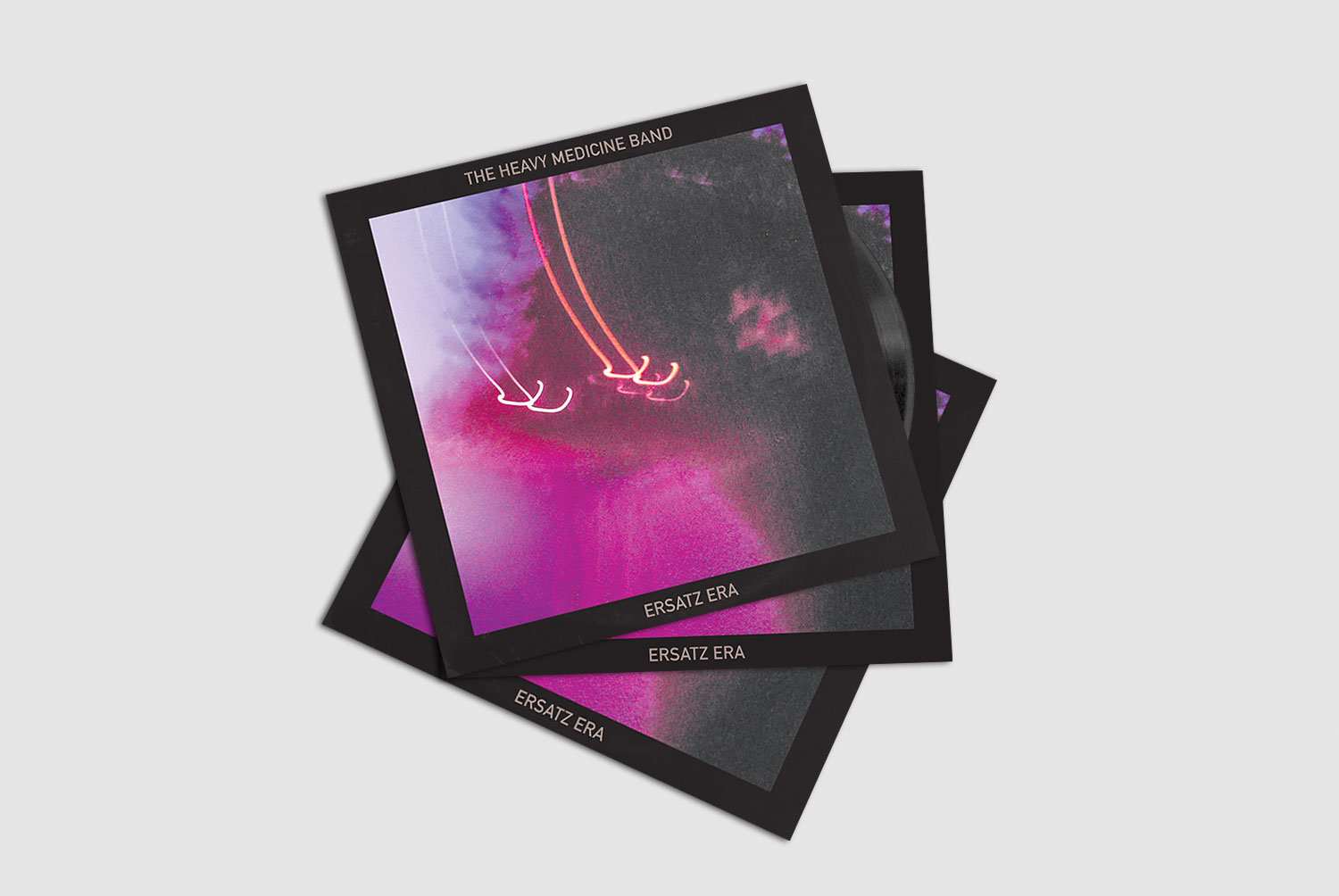
Final
Product

